Project Reveal: Kirby Residence
I know, I know. You don’t even have to make me feel worse than I already do about keeping you out of the loop on what’s been going on this year at MBID. I apologize! But that’s not what this post is about. This post is about an amazing project that I completed earlier this year that you NEED to see. It’s truly a testament to how you can customize any space within your home to work for you! My client purchased this new construction home for herself after years of renting, which allowed her to finally create the home office of her dreams. This space is immediately inside the front door of her home, which may traditionally be intended for a sitting or dining room. On the other side of that wall was her living room area, which at the time of our consultation was filled with worn-out furniture and knick-knacks brought from her previous home. Here is what the spaces looked like when we got started.
My client is a black woman who owns a commercial lighting company and so I knew she would already have an idea of what her aesthetic was given the fact that she looks at the details of others’ spaces all the time
THE VISION
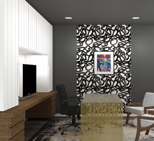
Lesli prepared these renderings of what we envisioned the new spaces to look like as a part of our presentation of all the finish and furnishings selections. Thankfully, in this case, the client loved 90% of what we proposed on the first try!
We wanted to embody the “Wakanda Artist’s Lounge” theme by using black, metal, and wood elements throughout the spaces. In the living room, we wanted to install an electric fireplace and create a bold statement with wallpaper and wood on the living room wall. Our client invested in an original art piece from local Durham artist Candy Carver which regrettably was being reframed when the final photos of the space were taken but you can see it below. Candy is a tremendous talent to the community so I was honested to be able to feature her in one of our projects.
HOME OFFICE AFTER
A proper entry - Because this office space is at the front door of her home, we wanted to create a little bit of separation for guests so we added a slat wall to the entry to separate the foyer and the office. A simple, but impactful element that really defined the space and leg the vibe.
Highlighting her brand colors - The client’s company brand has black, yellow, and white in it so we grounded the floor with the perfect rug that ties in all of those while still allowing her to roll around on her floors between her free standing desk and the built-in countertop.
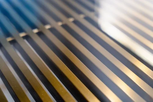
Speaking of the desk - This desk is actually one of the first items that I started with in designing her home office. Shortly after she told me that she wanted her office to be Wakanda-inspired, I found this gorgeous brass base table with slotted waterfall legs that I knew would be the perfect centerpiece for her office!
Custom built-in cabinetry - One of the things we discussed the most during her consultation was the necessity for storage! She needed somewhere to conceal her printer, large printed plans, resource books, and more. I knew that the best way to maximize this space was to build cabinetry that used every inch of the wall space. We left ample counter space between two towers of cabinetry so that she could have work surfaces both in front of and behind her in the office
Smart Light Control - Being that this office is situated in the front of her home which gets a lot of light throughout the day, “top/down bottom/up” window shades which can be controlled via Alexa were a must-have. We chose to continue them throughout the open area of the first floor to create unity.
FOYER AFTER
The Living Aura Art - If you’ve never experienced the magic of preserved moss art, you’re truly missing out! This one-of-a-kind art piece was created by a Winston-Salem, NC designer and artist using preserved moss. It smells divine and will stay beautiful with barely any maintenance forever! When we thought about embodying the vibe of Wakanda, we knew we had to add an impactful nature element to the space and this art will achieve that for years to come.
No Shoes in the House - It was important for there to be a solution that conceals all of the family’s shoes that was both slim and plentiful. Our team found this large cabinet that has 3 drawers with shoe storage and a single-door cabinet on the side to hang bags. You would never know upon entering this home that all of the dirty shoes, dog toys, and leashes are behind this sleek cabinet.
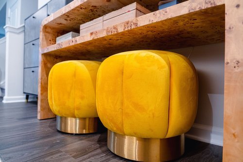
Versatile Additional Seating - This foyer faces the home office and after hours we wanted to be able to combine the two spaces into a lounge having these additional poufs allows guests to take a seat with a cocktail during happy hour
LIVING ROOM AFTER
The Fireplace Wall - This wall had the most opportunity for customization and we used every square inch of it to elevate this open floor plan living room. First, we sourced an ultra slim electric fireplace that could be installed within a standard-width GYP wall. Next, we selected a beautiful black patterned wallpaper that reminded me of the shields that the warriors held or the African masks they wore. Lastly, our custom woodworking team built a mantle with a front that folds down to reveal a cavity where all their electronics and whatnot can live.
The African Patterns - I found some awesome pillows and accessories at HomeGoods, TJ Maxx and the like. The fans were purchased from Reflektion Design which I have wanted to use for years! I’m so happy that they found a special place in this project. In my mind, they represent the mother and her two daughters.
The Leather Rug - We wanted to protect her beautiful wood floors with a durable, timeless rug and this herringbone hair-on-hide rug is the perfect addition. Her girls can spill popcorn and juice on it during movie nights and gaming binges and it will all come right up. I always recommend hair-on-hide rugs to families that are open to it because if they can withstand the elements that a cow does while living outdoors, they can certainly endure domesticated residents. :)
The Comfort for All - I fell in love with this Alder & Tweed sectional sofa when I saw it at High Point Market not just because of the super comfortable cushions, but the quality of the performance fabric and the beautiful leg details. We added poufs to the floor that can be used for additional footrests or seating for more guests too.
Working with this client was an outstanding experience and I am looking forward to serving more clients like her in 2024! Want to see more of the beautiful details of the project? Click here to see them all on the McNeill Brown Interior Design website.
I partner with several affiliate platforms where commission may be earned based on clicks and or purchases, and I would love it if you decided to use the links above! Affiliate links help bloggers like me to fund the free content that we provide on our blogs.


